

The word photography translates to ‘drawings made with light’. Graphic Design is known to be the combination between pictures and text in an advertisement. However, before photographs were created, graphic design had already existed. Behind any success story is a journey, and the journey of how photography and graphic design unified is just as important. According to Meggs and Purvis (2012), on March 4th 1880, history was created when the first printed photograph with full tones was published in the New York Daily Graphic, to begin a never-ending bond between the two. The following post will show how history has made the two almost inseparable.

When it comes to describing what photography really is, Meggs and Purvis (2012), believe it is about making pictures by a photochemical process, where chemicals help produce the image. A dark box, called a camera, is used with a slight opening, to allow light to flow through. This allows an image of the outside object to be reflected even brighter. During the 18th and 19th centuries, people were constantly looking for ways to create images without having to draw, however, these dark box images were just projections that could not be printed. Later a light sensitive material capable of capturing this light was added to permanently fix these projections into photographs. Even up to 10 years after the invention, photographers would still give illustrators the visual evidence needed to document an event. These illustrations were later added with text for printed publications. (Meggs & Purvis, 2012).

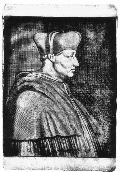
Until 1840, focus was still on illustrations, as photography was not yet detailed enough for publications. For that reason other curious inventors such as William Henry Fox Talbot continued to experiment with materials and their reactions to light. Talbot later invented photosensitive paper that allowed for negative images that created the bright parts of the subject as dark and the dark parts as light. It was in June of that year when Talbot was successful. His sensitive paper was exposed long enough to create an image, which was then developed using chemicals. (London, Upton & Stone, 2008) Many believe, “Talbot’s invention radically altered the course of both photography and, later, graphic design.” (Meggs & Purvis, 2012, p. 155) For that reason by the 20th century focus was on merging photographs and text together.
London, Upton and Stone (2010), believe that due to the many tones of gray in a photograph, type and image could not yet be printed together. So how were they printed to give such clean versions of what was known then as graphic design? According to London, Upton and Stone (2010) photographs were first made into drawings to be transferred onto woodcuts in order to be printed in newspapers. This was quite a lengthy process as well as uneconomical. By 1880, the process of printing the grey halftones was improved as type and photographs could now be printed together. Photographs became an essential part of newspapers, and were said to be real life moments only reproduced on paper, rather than fancy illustrations. (London, Upton & Stone, 2008) Until the mid 19th century, documenting scenes from war zones was uncommon. As London, Upton and Stone (2010) believe, wars were learned about from soldiers upon their return, or even late news reports. In 1850, Roger Fenton was the first to photograph the Crimean war in detail along with Mathew B Brady who had also captured the American Civil War. However, Brady had only managed to capture the aftermath of war, as photographing during battle was far too dangerous. It was Brady’s courage that lead to irreplaceable documents of American history. (London, Upton & Stone, 2008). These pictures are being used until today and are the base of what is known as photojournalism, the use of images to tell news stories along with text. We later begin to use the same definition for what we now know as graphic design. Despite the fact that the art movement known as naturalism, also known as artistic photography, had begun in the late 19th century, it wasn’t until the twentieth century that text and image, together were officially known as art and graphic design. (London, Upton & Stone, 2008). Meggs and Purvis (2012), believe the use of photography in graphic design mainly began at the German Bauhaus school, a place where concepts of all design and art movements were looked into. According to Meggs and Purvis (2012), one of Bauhaus’s instructors, Laszlo Moholy-Nagy was known to be an experimenter. He enjoyed playing with the size, angle and distortion of an image, as he believed photography had the ability to greatly influence poster design. In 1926, Laszlo Moholy-Nagy was equally intrigued by typography, he saw it as a vital tool of communication with the importance of legibility. (Meggs and Purvis, 2012). It was Moholy-Nagy’s curiosity that later started a new interest in joining these two art forms together at their institute which was later known as typo-photos.

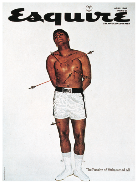
Another artist with similar techniques as those of Moholy-Nagy was Alexey Brodovitch. He was the art director at the well-known magazine, Harper’s Bazaar where he experimented with image size and positions. (Meggs and Purvis, 2012). For one of their issues, Brodovitch and an American artist, Man Ray collaborated together. Man Ray had been playing with photographs since the 1920s by reversing and manipulating images he created what is known as photo-plastics, which helped bring out his unconscious thoughts. (Meggs and Purvis, 2012). On their project together, for Harper’s 1935 issue, they used contrast in the height of letters to highlight the height of the woman on the opposite page. Meggs and Purvis (2012), believe it was Brodovich who taught many designers to experiment with photography, with the many collaborations he did for Harper’s Bazaar. In the late 1950s another young art director known as George Lois was ready to go to any extent to sell his work. According to Meggs and Purvis (2012), he believed that fully unified visual and verbal ideas were the essence to an effective conveyance of a message. Lois worked with the theory that can be restated as; verbal and visual components in modern communication are just as indivisible as words and music in a song. In the 1968 issue of Esquire Magazine, Lois featured Mohammed Ali, world’s heavy weight champion. According to Lois, (2014), Mohammed had recently converted to Islam and chose to object the offer to fight in the military. Repercussions followed when he got sentenced five years in jail, loss of his title, as well as getting banned from fighting. He followed by explaining his idea of comparing Mohammed to St. Sebastian and how he planned to use this poster as a protest with the idea of religious iconography as St. Sabastian had also gone through a similar battle. Lois (2014), mentions not only did this make a great poster for Esquire magazine; with a simple sentence ‘The Passion of Mohammed Ali’, it was later reproduced and sold as a protest poster. In less than three years Ali was free of his sentence, proving the power that comes with intelligently unifying photography and graphic design. The reason I chose this piece is because, Meggs and Purvis (2012) mentioned Esquire Magazine was at the verge of bankruptcy, and after hiring Lois for over 92 projects they were at a profit of three million dollars per issue.
Regardless of how common photography was becoming, how did film photography change to the digital one we know today? According to Savage (2014), experimenters George Smith and Willard Boyle are to thank for the creation the semiconductor circuit-the CCD which was the foundation for digital images to be saved and viewed later. They had worked together in 1969 with the aim to be able to capture images on a telescope, not only did this help us learn about what is beyond the earth, it was a big jump from capturing photos on a tangible material to having it saved virtually using chemicals. Despite how basic this technology may have seemed, in less than 30 years posters were now filled with digital photography once again harmonious with typography. According to Meggs and Purvis (2012), in 1996, a musician band by the name of Lou Reed decided to design a poster for one of their upcoming albums. They did so by using a digital photograph of a band mate and covering his entire face with the very personal lyrics from their songs. Another later example of how digital photography completely took the place of film with typography was in 2002, for the invitation of one of the world’s most renowned design firms, AIGA announcing the opening of nine more design studios. By portraying nine diamond shapes labeled with numbers, the background image is a digital photograph of a woman with make up tears and make up pouring down her face. Since this was part of the era when conceptual posters were at height, Meggs and Purvis (2012), believe these tears could have been caused by the heat when mining the diamonds, however the link between the tears and the opening remains unsolved to date. However, it wasn’t until 2003 when digital photography and typography together, not only created the layout of the poster but rather the main outline of the subject. Meggs and Purvis (2012), mention a designer by the name Reza Abedini who created a poster for the film Reves de sable. By using digital photography for the main face of the Persian woman, the rest of the composition was made with Farsi letters. Her entire cloak was decorated with these letters, although not legible but making very clear her cultural background as well as the theme of the film. 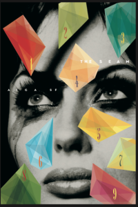 Despite how popular it has become to use photography and graphic design together, at times one must realize their individual importance as well. From the start with photographic negatives, to their combination as the typo-photo, photography is always adapting to the current trends. In this day and age, where we have gotten so used to life-sized billboards around us, we forget what it would be like without them. Thanks to Man Ray and many others, photography is quite an important part of our digital revolution. This paper listed the many examples through which harmony between photography and graphic design have helped change the world, only history will show what it further has to offer.
